When Amazon sales slow down, the default response is often to buy more traffic: raise bids, expand campaigns, or add promotions.
But more traffic is expensive, and it does not solve a product detail page that leaves shoppers uncertain.
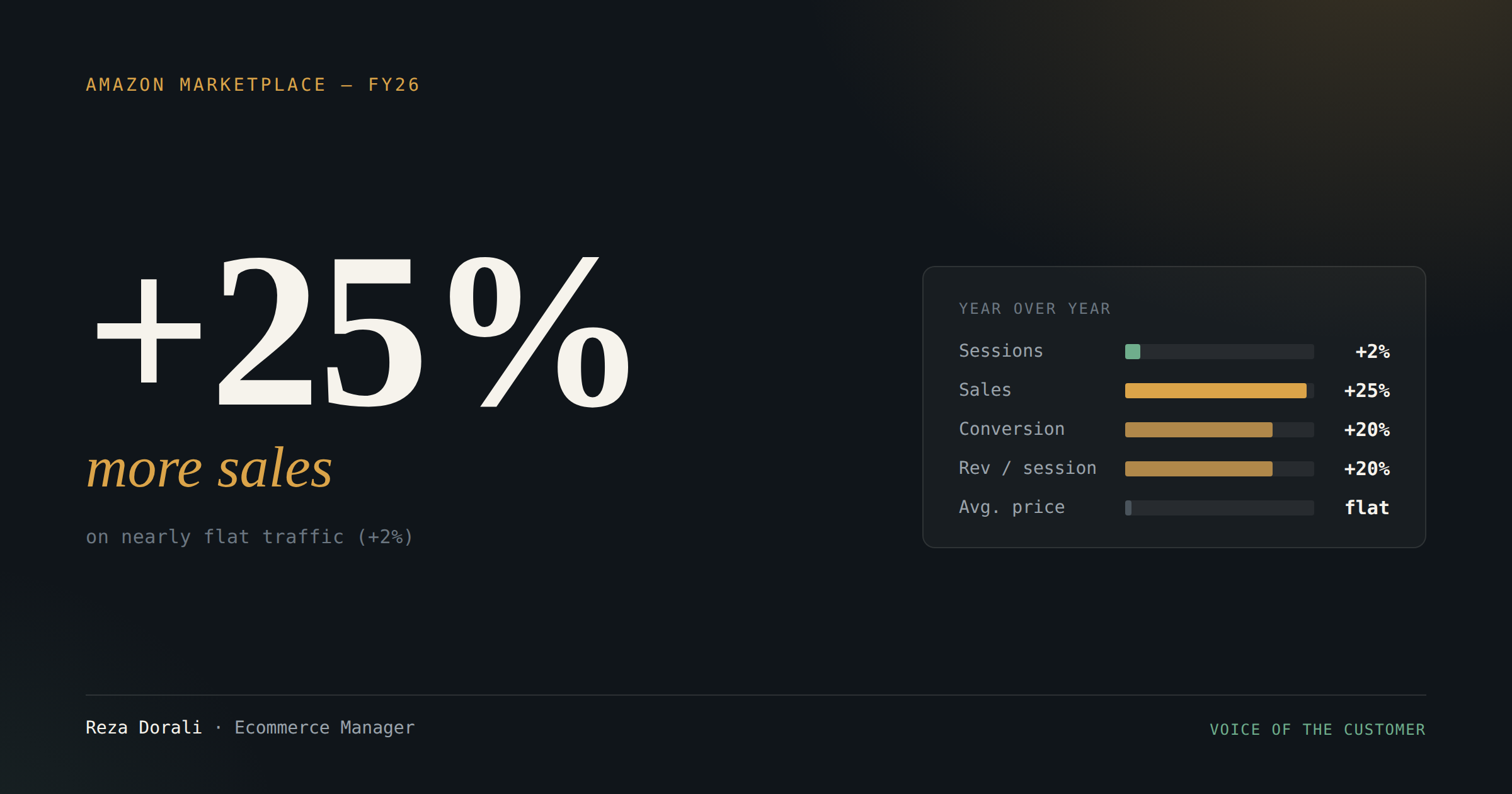
In a recent year-over-year review of an Amazon account I manage, we saw a different growth story:
- Sessions increased by only about 2%
- Sales increased by roughly 25%
- Conversion rate improved by more than 20%
- Revenue per session increased by more than 20%
- Average selling price remained essentially flat
In simple terms, almost the same number of shoppers arrived, but a much larger share decided to buy.
We started with the voice of the customer
Before rewriting the content, we reviewed customer feedback for each product. We studied both positive and negative reviews because they answered different questions.
Positive reviews showed us:
- Which benefits customers valued most
- Which outcomes made them happy
- How they naturally described the product
- Which types of customers were getting the best results
Negative reviews helped us identify:
- Areas of confusion
- Unmet or inaccurate expectations
- Recurring concerns and objections
- Usage details that were not explained clearly
- Situations in which the product might not be the right fit
We grouped these recurring themes and used them to define the intended customer more clearly: who the product was designed for, what problem it solved, and in which situations another option might be more suitable.
The question we tried to answer
Instead of asking:
"How do we get more people to the listing?"
We asked:
"What does a shopper still need to understand or trust before clicking Add to Cart?"
That shift changed how we approached the product title, bullet points, image stack, and A+ Content. We stopped treating them as separate assets and started treating the entire product detail page as one connected decision journey.
How we turned reviews into content
Product titles: We clarified the product type, primary use case, and intended customer using language shoppers could understand quickly.
Listing images: We gave each image a clear purpose. An image needed to communicate a valued benefit, demonstrate how the product is used, identify who it is for, set expectations, or address a recurring concern found in reviews.
Bullet points: We incorporated the questions, benefits, objections, and usage details that appeared repeatedly in customer feedback.
A+ Content: We used the additional modules to explain product fit, provide education, reinforce the outcomes customers valued most, and help shoppers choose more confidently.
Page-wide consistency: We aligned the title, bullet points, images, and A+ Content around the same target customer, benefits, and expectations instead of allowing each section to tell a different story.
Measurement: We evaluated performance through conversion rate and revenue per session — not revenue alone — so we could separate catalog productivity from traffic growth.
Why these changes likely mattered
Amazon shoppers make decisions quickly. If a listing does not immediately answer questions such as "Is this right for me?", "How does it work?" and "Can I trust the result?", increasing traffic simply sends more people into the same uncertainty.
Customer reviews gave us the language and context needed to answer those questions. Clearer titles, images, bullet points, and A+ Content made the offer easier to understand, helped customers self-select, and created more accurate expectations before purchase.
That is why the improvement in revenue per session was such an important signal: the catalog was generating more value from each visit.
A necessary caveat
This was not a controlled A/B test, so it would be inaccurate to credit every incremental sale to content alone.
Buy Box performance improved modestly, and lower competitive pressure also contributed to the result. Advertising continued to support the business, but nearly flat total sessions indicate that traffic growth was not the primary explanation. Pricing was also largely unchanged.
The most defensible conclusion is that review-informed improvements across the product titles, bullet points, listing images, and A+ Content were strongly consistent with the conversion lift, while retail conditions also contributed to the final result.
The takeaway
Before increasing advertising spend, audit the product detail page as a conversion system. More traffic can amplify a strong listing — but it can also amplify confusion.
Sometimes the best growth lever is not bringing in more shoppers. It is listening to existing customers and helping the shoppers who already arrive make a confident decision.
Questions to ask during your next listing audit
Self-audit
- Have you reviewed both positive and negative customer feedback?
- What benefits do customers mention most frequently?
- What concerns or misunderstandings appear repeatedly?
- Does the page clearly explain who the product is for?
- Does it clarify when the product might not be the right fit?
- Do the title, images, bullet points, and A+ Content reflect what customers actually value and ask about?
- Are you measuring conversion rate and revenue per session alongside traffic?
Originally published on LinkedIn — comments and discussion are open there.
View on LinkedIn ↗